Colorful Art: Vibrance Beyond Borders

Overview:
This activity delves into the fascinating relationship between color and emotion in the realm of interaction design. Participants will explore how colors can evoke specific emotional responses and enhance user engagement in various contexts, such as digital interfaces, urban environments, and interactive installations.
Objectives:
Understanding Emotional Responses to Color: Analyze the psychological effects of colors and their cultural significance in different settings.
Applying Color in Design: Experiment with color combinations to create designs that resonate emotionally with users.
Interactive Engagement: Develop prototypes or visual representations showcasing how color can be used dynamically to influence user experience.
Highlights:
Workshops and Discussions: Led by experts in design and psychology, these sessions will cover theories such as the psychology of color, cultural color perceptions, and practical applications.
Hands-On Activities: Participants will engage in interactive experiments, using tools and technology to create color-based emotional experiences.
Showcase: The event will conclude with a showcase of participant projects, demonstrating innovative uses of color in interaction design.
This activity is ideal for designers, students, and professionals interested in blending creativity, psychology, and technology to design emotionally engaging experiences.
Mastering the creation of a strong color palette is a critical skill for designers. A color palette that clashes or falls flat can lose users in seconds, even when the content of a site is excellent.
Website Color Scheme
We know the importance of every single feature in website design. We know that it should load fast, read well and look awesome in order to uphold your brand image and performance. The site should be built and designed in a way that is feature rich at af…
How does color influence emotion
The way that color influences emotions hasn’t been particularly widely studied, but a few studies have been done. Color has been shown to influence everything from the effects of placebo pills to how colors can impact academic test performance. These studies focus largely on the effects of color on emotion and performance, but rarely explore why colors have those effects.
Much of what we know about color psychology comes from tradition and anecdotal evidence. What we do know is that color does have an impact on people’s perceptions. Some of those perceptions are universal, while others are heavily influenced by culture. For example, in most western cultures, white is associated with purity and peace; in many Asian cultures, though, white is associated with death.
From a marketing design perspective, knowing which colors are most popular and which emotions are evoked by each color are vital. The most popular favorite color in the world is blue, which helps explain why it’s such a popular color for many brands.
Color has a profound effect on brand awareness , increasing brand awareness by up to 80%. It’s also a deciding factor on the products people buy and heavily influences consumer purchasing decisions.
While the meanings of each color are influenced by their exact shade, here’s a brief rundown of the major color families.
- Red: love, passion, danger, anger
- Orange: happiness, energy, vitality, activity
- Yellow: cheerfulness, joy, intellect, mental clarity
- Green: abundance, nature, new beginnings, wealth
- Blue: loyalty, honesty, reliability, communication
- Purple: royalty, creativity, mystery, spirituality
- Pink: femininity, romance, youthfulness
- Black: power, sophistication, evil, exclusivity
- White: simplicity, peace, modernity, innocence
- Gray: sophistication, intellect, compromise
- Brown: strong, durable, honest
As already mentioned, the exact shade of the hue being used can have a profound impact on its meaning. For example, bright green is associated with nature and growth, while dark green is associated with wealth and money.
Creating a color palette
Anyone can pick a color based on its established emotional impact and use it for a brand. Where the real art and science comes into play is in creating complete color palettes that evoke the right emotions by playing off one another.
Understanding the traditional color scheme patterns: monochromatic, complementary, analogous, split-complementary, triadic, tetradic, and square.

Each type of color scheme has a different impact on how the colors play off one another.
Monochromatic color palettes keep the meaning of the single color used.
Analogous color palettes use neighboring colors, which generally complement each other’s meanings. For example, pairing green, yellow-green, and yellow together creates a design that’s fresh and energetic.
Complementary colors can be trickier to pair. When you take two complementary colors and put them side-by-side, they can create a sort of vibrational effect along the border. While this is occasionally a welcome effect, you’ll generally want to use a lighter or darker version of one of the hues to prevent it.
These complementary color palettes often use colors that have somewhat opposing meanings. For example, blue is subdued while orange is energetic. It takes some experimentation to make these colors play well together and give the impact you’re looking for.
Split complementary, triad, tetrad, and square schemes combine colors that can also have opposing meanings. Experimentation is key. Using brighter or darker versions of these colors make their meanings stronger, while lighter or muted versions can soften the strength of their impact.
Applying the 60-30-10 rule
Regardless of what color palette structure you choose to use, following the 60-30-10 rule provides some guidance in how to actually combine them. This rule states that your design should use one color for 60% of the visual space (generally a neutral color like white, black, or gray), 30% for the brand or another secondary color, and 10% for an accent color, often a brighter or stronger color. The color you use for 30% of the design will have a stronger impact on emotion than the one used for 10%, so consider carefully what you want the prevailing emotion to be.
If you’re using more than three colors, you can still implement the 60-30-10 rule. Just make sure that your more neutral colors account for 60% of the visual space, the colors you want to have the most emotional impact account for 30%, and the remaining 10% are used for accent colors to either reinforce that emotional impact or add energy to the overall design through conflicted meanings.
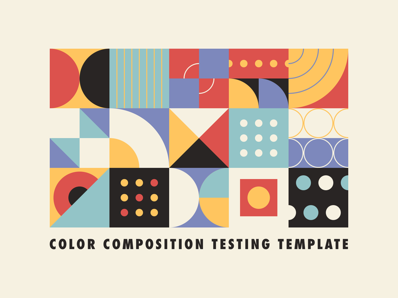
Color Composition Testing Temp[late
by Justin Mezzell
Hey! If you’re looking to pressure test some colors and the relationship they have with one another, I threw together a little AI file that you can download and see how they’re all working together. Hope it’s helpful! You can download the attachment to…
Experimentation with color and emotion
Experimentation is one of the most important aspects of creating solid color palette. It’s a good idea to establish the main color of the design first (such as blue, green, etc.) based on the emotions you want to convey (or the brand requirements). From there, you can experiment with different shades of those hues and with which colors you want to combine them.
A good color palette can’t be rushed. It’s rare to come up with a winning color palette on your first try. Even with years of experience, most designers spend days or even weeks finalizing color palettes for their designs. Color’s impact cannot be understated, so spending time on this portion of the design will pay off in the end product ■


